Love it or hate it, there’s no denying the popularity of HTML emails. And, like the web before it, the inbox has officially gone mobile—with over 50 percent of email opensoccurring on mobile devices.
Still, email design is an outrageously outdated practice. Remember coding before web standards became… standards? Welcome to the living hell of email design.
But coding an email doesn’t need to be a lesson in frustration. While email designers still have to build layouts using tables and style them with HTML attributes and—gasp!—inline styles, a number of intrepid designers are taking modern techniques pioneered for the web and applying them to the archaic practice of email design.
Building on the principles of responsive web design first codified by Ethan Marcotte, a revolution in email design is giving birth to an experience fast approaching that of the modern web. Subscribers need no longer be subjected to terrible reading experiences, frustrating touch targets, and tiny text.
The value of HTML email
Whether or not you like HTML email, it is a vital tool for nearly every business. When it comes to marketing, email consistently outperforms other channels like Facebook and Twitter. More importantly, email allows you to interact with a potentially massive audience in an increasingly personal way.
You may not actively engage in email marketing, but chances are that, as a web designer or developer, you use email to communicate with users on a regular basis. It could be sending a receipt, updating users on a new product feature, or letting them know about your latest blog post. Whatever the reason, email is an important and often overlooked medium.
Many developers choose to send customers plain text email. While plain text has many benefits (easy to create, renders everywhere, downloads quickly, etc.), HTML email has a number of advantages:
- Hyperlinks. You can link out to landing pages from an HTML email and build traffic and engagement.
- Design. A well-designed HTML email lets you reinforce your brand, even in the inbox.
- Hierarchy. You can build hierarchy within HTML emails and more easily call attention to important copy or vital links.
- Tracking. HTML email allows you to track opens and engagement—valuable data that can be used to optimize your marketing efforts.
By not giving email as much attention as your pixel-perfect app, you are effectively losing out on 1) a valuable branding opportunity, 2) the ability to track opens and interactions in your emails, and 3) the opportunity to provide an amazing user experience outside of your application.
HTML email sucks
Designing and developing HTML email has traditionally ranked among the worst experiences for any web designer. It’s like getting into a time machine and stepping out into a hellish ’90s world of table-based layouts, inline styles, non-semantic markup, and client-specific hacks.
Here’s just a small sampling of why HTML email can be a pain:
- No Standards. Sure, we use HTML and CSS. But not like on the web. No real standards exist between email clients, leading to some crazy code.
- Email Clients. Email clients, like Outlook and Gmail, all render HTML and CSS differently, often outrageously so. Which leads to…
- Lots of hacks. Even well-designed email campaigns need to rely on client-specific hacks to make things work.
- No JavaScript. The web’s favorite language has no place in email, as email clients (rightly) strip it due to security concerns. Goodbye interactivity.
- Inline styles. I’d love to separate structure from presentation. Unfortunately, most email clients force you to rely on inline styles and attributes for nearly everything in email.
While things likely won’t change anytime soon, there is a movement in the email design community (yes, one does exist) to alleviate the misery normally associated with developing email campaigns. A number of companies and individuals are improving the tools and methods of email design, and sharing their knowledge more than ever before.
The company I work for, Litmus, is one of them. We build instruments to make testing and tracking email campaigns as painless as possible. And we’re all-in on spreading information about email marketing in general, and email design specifically. We even started a dedicated community to connect email marketers, allowing them to share their knowledge, refine techniques, and learn from both us and each other.
While I reference some of Litmus’ tools and resources in this article, there are a number of other companies and people working hard to improve the art of email design. In particular, both MailChimp and Campaign Monitor have excellent blogs and guides. And people like Anna Yeaman, Nicole Merlin, Fabio Carneiro, Elliot Ross, and Brian Graves are all working to make email design a true craft.
The changing inbox
Just like the rest of the web, the inbox is becoming mobile. In 2013, 51 percent of users opened emails on mobile devices. That number is likely to increase, especially considering that a growing number of people rely on their mobile device to access the internet, both out of habit and necessity.
The good news is that web designers can adapt their existing skills and apply them to email campaigns, creating a beautiful user experience on a channel vital to most users, but ignored by many designers.
How HTML email works
Generally speaking, HTML email is just like designing a web page—assuming web design has no knowledge of anything post-Designing with Web Standards. HTML emails rely on three things: tables, HTML attributes, and inline CSS. As you learn to build HTML emails, keep in mind that, due to email client rendering engines, we are working with a very limited subset of HTML and CSS. Campaign Monitor maintains anexcellent chart of what CSS is supported across major email clients.
Let’s briefly go over the basics of HTML email before looking at how to make emails responsive. As an example, I’ve adapted the template we use for our own newsletters at Litmus. Thanks to both Litmus and our wonderful designer, Kevin Mandeville, A List Apart readers can learn from and build on the same code we use for most of our campaigns—it’s now hosted on the A List Apart Github account. To see how it performs across clients, you can check out the full range of Litmus tests.
TABLES
Most web designers use tags like the div, header, section, article, nav, and footerfor building the structure of web pages. Unfortunately, email designers don’t have the luxury of using semantic elements. Instead, you *have* to use HTML tables to lay out your email campaigns. These tables will be nested… deeply.
Basic styling of tables will largely use attributes that most people haven’t used in quite some time: width, height, bgcolor, align, cellpadding, cellspacing, and border. Coupled with inline styles like padding, width, and max-width, designers can build robust email layouts.
Here’s an example of what a well-coded table in email looks like:
<table border="0" cellpadding="0" cellspacing="0" width="100%">
	<tr>
		<td bgcolor="#333333">
			<div align="center" style="padding: 0px 15px 0px 15px;">
				<table border="0" cellpadding="0" cellspacing="0" width="500" class="wrapper">
					<tr>
						<td>…Content…</td>
					</tr>
				</table>
			</div>
		</td>
	</tr>
</table>
You can see how we nest tables and use the border, cellpadding, and cellspacingattributes to ensure that there aren’t unnecessary gaps in the design. A bgcolor is applied on the table-cell level, which is a more reliable method than background orbackground-color (although background-color does have its place).
One interesting thing to note is that a div is used to center the nested table and provide padding around the content. While tables should make up the bulk of your structure, the occasional utility div is useful for aligning content blocks, providing padding, and setting up some basic styles. However, they should not be used as the main structure of an email since most email clients have trouble with at least some aspect of the box model, making it unreliable for laying out emails.
IMAGES
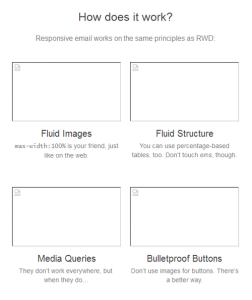
Using images in email is very similar to using them on the web, with one caveat: a number of email clients disable images by default, leaving subscribers looking at a broken, confusing mess.
An email with images disabled
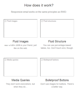
While there is no way to automatically enable those images, we can improve the situation by using alt-text to provide some context for the missing images. What’s more, we can use inline styles on the img element to style that alt-text and maintain some semblance of design.
<img src="img/fluid-images.jpg" width="240" height="130" style="display: block; color: #666666; font-family: Helvetica, arial, sans-serif; font-size: 13px; width: 240px; height: 130px;" alt="Fluid images" border="0" class="img-max">
Using the code above, our missing image now makes a bit more sense:
Alt-text goes a long way
CALLS-TO-ACTION
One of the main advantages of HTML email is the ability to include clickable hyperlinks. Beyond just including links within copy, HTML email allows you to use big, beautiful buttons to entice subscribers.
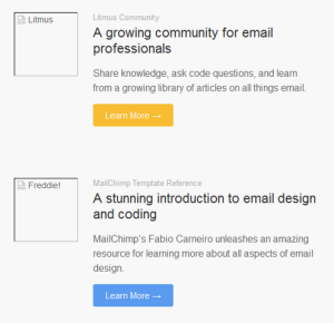
Many email marketers use linked images for buttons. However, using bulletproof buttons, designers can craft buttons via code that renders reliably across clients, even with images disabled.
The table below is an example of an all-HTML bulletproof button, which uses borders to ensure the entire button is clickable, not just the text:
<table border="0" cellspacing="0" cellpadding="0" class="responsive-table"> <tr> <td align="center"><a href="http://alistapart.com" target="_blank" style="font-size: 16px; font-family: Helvetica, Arial, sans-serif; font-weight: normal; color: #666666; text-decoration: none; background-color: #5D9CEC; border-top: 15px solid #5D9CEC; border-bottom: 15px solid #5D9CEC; border-left: 25px solid #5D9CEC; border-right: 25px solid #5D9CEC; border-radius: 3px; -webkit-border-radius: 3px; -moz-border-radius: 3px; display: inline-block;" class="mobile-button">Learn More →</a></td> </tr> </table>Bulletproof buttons look great with images disabled
Once you have those basics down, it’s time to see how we actually make an email work well across a range of device sizes.
How responsive email works
Just like with responsive websites, there are three main components of a responsive email: flexible images, flexible layouts, and media queries.
The only difference between the web and email is in how these three techniques are implemented.
In email design, we have a limited subset of HTML and CSS at our disposal. We can’t rely on properties and values that designers use for responsive sites on the web; margins, floats, and ems don’t work in many email clients. So we have to think of workarounds.
FLEXIBLE IMAGES
Fluid images aren’t too tricky. Although they use the width property set to 100%, some clients have trouble rendering images at their intended size unless the width and height are defined using the corresponding HTML attributes. Therefore, we have to build them to specific dimensions and knock them down later.
The first step is ensuring that images are robustly coded. Let’s look at our image of the email screen from earlier.
<img src="responsive-email.jpg" width="500" height="200" border="0" alt="Can an email really be responsive?" style="display: block; padding: 0; color: #666666; text-decoration: none; font-family: Helvetica, arial, sans-serif; font-size: 16px;" class="img-max">Notice that display property that’s included? It’s just one example of the many hacks required to deal with naughty email clients, as is the border attribute. Most webmail clients add space around images in an attempt to fix line-height issues that may arise. Making images block-level will kill that spacing and save your design.
Now, when we want to make our images fluid, we can do so in a media query in the head of our email:
img[class="img-max”] {
	width:100% !important;
	height: auto !important;
}
Not every image will need to be fluid. Elements like logos and social icons typically stay the same size regardless of device size, which is why we target flexible images using a class.
Since we will always be overriding inline styles and HTML attributes, the importantdeclaration is used to ensure that our responsive styles take precedence when the document is rendered.
Let’s jump into something a bit more difficult.
FLEXIBLE LAYOUTS
Most web designers are familiar with building responsive designs using semantic elements sized with relative units like percentages, ems, and rems. While we can still use percentages for flexible layouts in email, they will be used inline on tables and subject to a few limitations.
Nearly all of our tables will use percentages for their widths. The one exception is a container table with specific pixel dimensions to constrain the overall width of the email design to prevent it from blowing out in clients that don’t handle percentages well, typically most versions of Microsoft Outlook.
Let’s start with the container table:
<table border="0" cellpadding="0" cellspacing="0" width="500" class="wrapper">
	<tr>
		<td>…Content…</td>
	</tr>
</table>
You’ll see that we use the width attribute to force the table to be 500 pixels wide.
This container will hold every other nested table in the email. Since it will constrain everything to that 500-pixel width, we can safely use percentages to size our other tables.
But what good are flexible tables if the email is always 500 pixels wide? Take a look at that container table again. Notice that I included a class of wrapper. We’ll use that selector to make our emails truly responsive using (what else?) media queries.
MEDIA QUERIES IN EMAIL
Media queries in email work just like in web design. By including them in the head of your email, you can target specific device attributes and adjust your styles accordingly.
Keeping things simple, we’ll target viewports with a max-width of 525 pixels and below. Then, targeting that wrapper table, we can override those HTML attributes and inline styles to force the table to be the full width of the screen on mobile devices.
@media screen and (max-width:525px) {
	table[class=“wrapper”] {
		width:100% !important;
	}
}
We can also target any nested tables and do the same—effectively stacking content sections for an improved mobile experience. It’s not a bad idea to bump up the size of text and buttons on mobile, either.
@media screen and (max-width:525px) {
	body, table, td, a {
		font-size:16px !important;
	}
	table[id=“responsive-table”] {
		width:100% !important;
	}
}
The main drawback of using media queries is that they are not supported everywhere. While WebKit-based email clients like iOS Mail and the default Android email app work well, older Blackberry devices, Windows Phone 8, and the Gmail app on every platform disregard media queries.
Fortunately, iOS and Android make up the majority of mobile email audiences, so you can rely on most subscribers seeing your responsive emails as intended.
Explore email design
The techniques described above are just the beginning. Intrepid email designers are exploring the use of web fonts, SVG, and CSS3 animations in email. Sure, email design is hard and things break constantly, but that shouldn’t prevent you from exploring advanced techniques to see what works for you and your audience.
My one recommendation is to test the hell out of any email you build. Email clients are far worse than browsers in terms of rendering and support for HTML and CSS. Testing both on devices and using an email preview service—be it Litmus, Email on Acid, your own device lab, or something else entirely—helps identify problems and allows you to work out issues before sending to a million subscribers.
Aside from testing your code and rendering, track all of your emails and test what kind of content, copy, design, and sending cadence resonates with your audience.
Above all, don’t disregard email design. It’s a necessary evil, but it’s getting better all the time. A community is finally forming around email design, and techniques are constantly being refined and perfected. Responsive email design is one of them. If you really care about your product and presence on the web, you will take the passion and craft you apply to your app’s interface and transfer it to one of the most widespread and valuable mediums around.
Source: Can Email Be Responsive BLOG
Author: Jason Rodriguez
Referenced site: http://http://alistapart.com/article/can-email-be-responsive


