Responsive design is quite popular these days. It is a new and revolutionary way of planning to develop websites which will be compatible for both PC, and laptop users as well as for the latest generation of tablet and mobile users. Right now it is recommended either to develop separate sites dedicated to the mobiles or tabletswith separate web addresses or use a device that will detect the target devices and redirect the users to the device specific site. But there are two unique issues related to these suggestions.
- The device identification script that will be used to identify the mobile devices can face problem in tracking the huge number of mobile devices are continuously hitting the market every other day.
- Developing and maintaining so many numbers tablet and mobile specific sites may take lots of time and can be lot more expensive than the normal.
Responsive design facilitates with a comparatively better solution for the disintegration of the web devices. The most important target is to create a chain ofscalable designs intended towards the particular group of devices by utilizing scaling images and flexible grids. Web browsers offer data on the maximum number of pixel width that they support with the help of a CSS element that is termed as a media query. This value helps us to assume about the target devices as the maximum size of the width will be nearly the size of the screen of the device.
Instead of developing different websites with different contents, separate interfaces or creative elements, it is better to develop a responsive site that will adjust and scale the layers, which are for presentation, to offer the best feel within the screen space available.
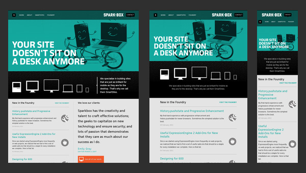
Sparkbox
Many think that responsive design should be taken into account for every new website designing project. Though this may not be possible for all projects because of the factors such as budget, time, technical expertise and target audience. But at least it should be discussed while planning for web designing.
Media Query
Breakpoint is said to be the media query value which mark the switching of a new type of device. Mainly fluid designs are created to fit it within the preset limit of the media query. These limits will be equated to various types of devices like laptop, desktop, tablet and smart phone.
Once this threshold of the breaking point is crossed, another set of CSS codes will get activated to create the webpage with the help of perfect fluid layout, images and text format, navigation design targeting to these devices. There is no set of breakpoints that is universal as the idea of responsive design is quite new to the industry till date.
Once the media query range and breakpoints are fixed now it is the time to fix the width of the design. Though the designs are developed to fit within the ranges of the media query still a starting point is necessary to be there. It is probably the simplest to set the lower end value of the media query range for the width of the content and later fit the layout upward if necessary. But there is an exception in the mobile portrait design where the value is set at 310 representing the commonest minimum width used for smartphones. In this case, the design needs to be fitted both upwards and downwards as per the requirement.
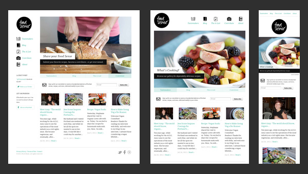
Food Sense
It can be considered as the convenient option for the most number of projects related to responsive designing. Two options for mobile designing can be merged together to get two completely new and separate designs offering far better results. There is an extra benefit i. e. you can add breakpoints later if you wish to adjust extra-large screens without designing the site all over again.
There is certain misconception related to the responsive design that, it is only developed for web browser on mobile. It is all about designing websites for a particular screen size. Both developers as well as designers need to change their thinking about web designing. There are many designers who come from graphic designing background and are familiar with working in limited width mediums likebillboards, ads, fliers and many more.
But while designing responsive sites the designers must have an idea on how the sites will look on different widths to make the responsive site the best one. They also think about the way the navigation should be adjusted. Moreover, the designers should realize that they will not be able to control the design anymore and have to adopt new flexibility. If the responsive design turns out to be a successful one then it is possible to develop wonderful sites with huge usage in all devices.
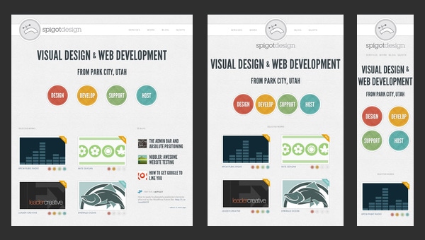
Spigot Design
Responsive Web Design and CMS
Responsive design is a new concept which is growing rapidly all over the world. But still its compatibility with content management systems and other platform is uncertain. Most of the discussions related to responsive web design come from the front end development point of view. However, the large number of websites are created with strong back end CMS. There are few content management systems which allow better grip over the presentation layers than the others.
Therefore, the expense and the amount of effort for moving to responsive design may differ. Companies having strong technical expertise should evaluate the way using which they can align well with the responsive design plan and at the same time should define the upgrades as well as the other changes that are needed to be done.
Like many other new technologies responsive design is also not free from few drawbacks. Internet Explorer 6 and 7 do not support some features that are used in an ideal responsive design. But that does not mean that the design will not be visible in comparatively older browsers. The design may function or look a bit different than the way it is looked in the newer browsers unless you add some extra codes particularly for those browsers. It is suggested that before you start designing you should take a look at the web analytics data to check the percentage of your target audience depends on the older browsers.
Clean Air Commute Challenge
The technique of using only the most popular screen size as reference may become backdated with the modernization of the devices. The new way of responsive designing which is emphasizing more on content, rather than on context is getting introduced to the market. But this is yet to be standardized.
Media queries that is used downloads all the contents even if you do not see them on screen. This reduces the download speed of responsive websites comparing to the device designed sites.
You should always opt for a site that is compatible with all kinds of devices. If you already have a site then it might be difficult or expensive to make it adapted to the responsive design. Therefore, it will be easier to use mobile website template which is a convenient and an easy way of adapting conventional websites for mobiles and other devices.
Source: Why Responsive Design are Best for Mobile Devices BLOG
Author: Angelina Jennifer
Referenced site: http://designmodo.com/why-responsive-design/


