
Picture this. A customer in Davao is scrolling through her phone, looking for a reliable supplier for her small bakery business. She finds your website, taps the link, and waits. And waits. The page finally loads, but the menu is confusing, the text is too small to read, and she can’t find your contact number anywhere. She gives up and clicks back to Google. Ten seconds later, she’s on your competitor’s site instead, and that competitor just landed a client that should have been yours.
This happens more often than most business owners realize. You could have the best product or service in Davao City, but if your website UX design doesn’t make it easy for people to buy from you, they simply won’t. That’s not a marketing problem. That’s a user experience (UX) problem, and it’s one of the most overlooked reasons businesses lose sales online.
Let’s talk about why this matters, what it’s actually costing you, and what you can do about it.
What Is UX Design, Really?
UX design is simply how a person feels while using your website. Is it easy to find what they need? Does it load fast? Does it make sense on a phone as much as it does on a desktop? Good UX doesn’t necessarily look flashy. Often, it’s invisible, because everything just works the way people expect it to.
Bad UX, on the other hand, is very visible. It’s the pop-up that won’t close. It’s the menu that takes three clicks to find a simple price list. It’s the “Contact Us” button that leads nowhere. Every one of those small frustrations chips away at trust, and trust is what gets someone to actually pay you.
The Real Cost of a Clunky Website
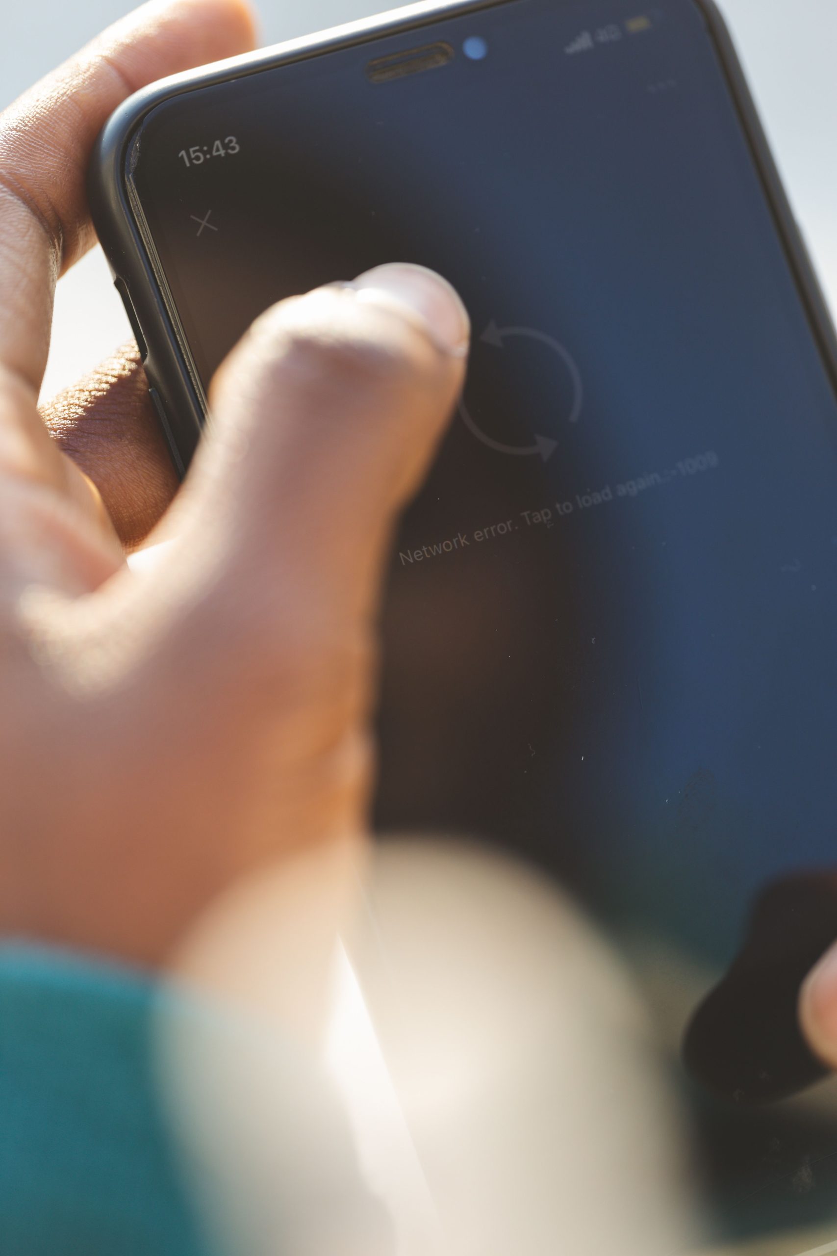
Here’s the part most business owners never see: a bad website doesn’t just lose you sales, it loses you customers you never even knew you had. They don’t complain. They don’t email you to say your site was confusing. They just leave, and they don’t come back.
Think about how this plays out for a real Davao business:
- A carinderia owner spends money on Facebook ads to drive traffic to her new website, but half of visitors leave within seconds because the page takes too long to load on mobile data.
- A construction supply company has beautiful photos of their products, but the layout is so cluttered that customers can’t figure out how to request a quote.
- A tutorial center’s website looks fine on a laptop, but on a phone, the enrollment form is broken, so parents just message a competitor on Facebook instead.
None of these businesses have a “marketing” problem. They have a website layout and design problem that’s quietly bleeding potential clients every single day.
Why This Matters More in Davao Than You Might Think
Davao’s business scene is growing fast, and more customers here are searching, comparing, and deciding to buy directly from their phones. Many are on mobile data, not always fast wifi, which means fast loading web pages aren’t a nice-to-have. They’re the difference between a sale and a bounce.
At the same time, competition is getting sharper. Whether you’re running a real estate agency, an online shop, or a service-based business, chances are your competitor down the street or across town already has a cleaner, faster website. If theirs feels easier to use, that’s who gets the inquiry, even if your product is better.
How Website UX Design Directly Increases Sales in Davao
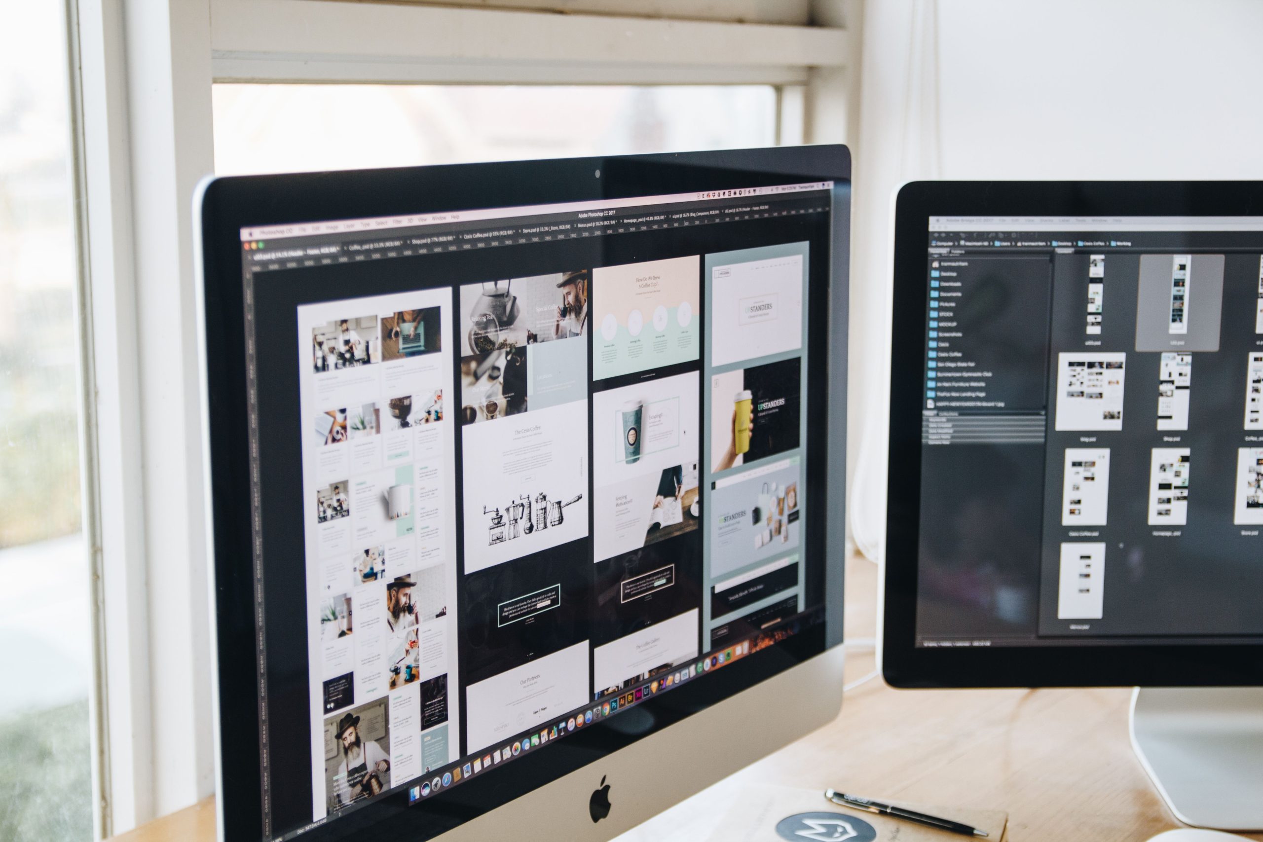
This is where it gets exciting, because unlike a lot of marketing efforts, improving your UX has a direct and measurable effect on your bottom line. Here’s how:
1. Easy Navigation Builds Confidence
When a visitor can find what they need in two or three clicks, they feel like they’re dealing with a business that has its act together. An easy navigation website doesn’t just look organized, it signals that you’ll be easy to work with too. That confidence is what turns a browser into an inquiry.
2. Speed Keeps People From Leaving
Most visitors decide within a few seconds whether to stay or leave a page. If your site is slow, you lose them before they even see what you’re offering. Fast loading web pages aren’t just good practice, they’re the entry ticket to getting your message across at all.
3. Clarity Removes Hesitation
A confused customer rarely buys. If your pricing, your services, or your contact details are hard to find, people assume you’re either hiding something or you’re simply hard to reach. Improving user experience on your site means removing every unnecessary question mark in the customer’s mind before they even talk to you.
4. Trust Signals Seal the Deal
Testimonials, clear photos, real contact information, and a design that looks current all tell a visitor: this is a legitimate, professional business. Combined with smooth navigation, this is often what pushes someone from “just looking” to “let me send a message.”
Practical Tips You Can Apply Right Now

You don’t need to overhaul everything overnight. Start with these:
- Check your mobile site first. Most of your Davao visitors are likely browsing on their phones. If it’s clunky there, fix that before anything else.
- Count the clicks. From your homepage, how many taps does it take to reach your contact form or price list? If it’s more than three, simplify it.
- Remove distractions. Too many banners, pop-ups, or auto-playing elements slow your site and annoy visitors. Keep the page focused on one clear goal per section.
- Make your call-to-action obvious. “Message Us,” “Get a Quote,” or “Book Now” should be visible without scrolling too far.
- Test your loading speed. A page that takes more than three seconds to load is already losing people. Compress images and simplify heavy design elements where you can.
These small changes are often part of a broader website redesign to improve conversion rate and user experience in Davao, and even fixing just one or two of them can noticeably change how people respond to your site.
Why Businesses Turn to Rypaci for This
At Rypaci IT Solutions, we’ve worked with Davao business owners who assumed their slow sales were a marketing issue, only to find out their website was quietly turning customers away before a single ad dollar even had a chance to work. We look at your site the way your customer does: how it loads, how it feels to navigate, and where people are likely to give up.
From there, we focus on how to increase website sales through practical, no-nonsense improvements to your layout, speed, and overall experience, not just a fresh coat of design paint. Whether you need a full redesign or a few targeted fixes, our goal is always the same: turn more of your visitors into actual paying clients.
Your Website Should Be Working as Hard as You Do
You put in the effort to run your business well. Your website should be doing the same, quietly convincing visitors to trust you and reach out, even while you’re busy with everything else on your plate. If your site is slow, confusing, or hard to use on a phone, you’re likely losing sales you don’t even know about.
Ready to find out what might be costing you customers? Reach out to Rypaci IT Solutions today for a website review, and let’s turn your site into one that actually sells for you, twenty-four hours a day.