
Setting up an online store sounds simple these days. Pick a platform, upload your products, share the link, done. But here’s what a lot of Filipino retailers find out the hard way: having a store online and having a store built on a real e-commerce website design checklist that actually converts visitors into paying customers are two very different things.
Maybe you’ve already tried this. You launched your shop, shared it on social media, got some traffic, but the sales just weren’t coming in the way you expected. If that sounds familiar, chances are it’s not your products. It’s what’s missing from the shopping experience itself.
Here’s what you actually need in 2026, and just as importantly, why each piece matters.
Payment Gateways That Filipino Buyers Actually Use
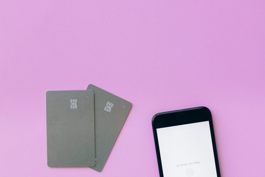
Let’s start with the feature that probably has the biggest direct impact on whether someone completes a purchase or abandons their cart entirely.
GCash and Maya payment integration isn’t optional anymore for stores selling to Filipino customers. Most shoppers today don’t want to type in a credit card number, and many don’t even have one. They want to tap, scan, or confirm a payment the same way they already do for everything else.
Think about it from your customer’s side. She’s ready to buy that pair of shoes, but your store only accepts bank transfer with manual confirmation. That’s an extra step, an extra wait, and an extra chance for her to change her mind before she finishes checking out.
What your payment setup should include:
- GCash and Maya integration, since these are the two most widely used e-wallets in the country
- Credit and debit card support for customers who prefer that route
- Cash on delivery, if your logistics can support it, since it still builds trust with first-time online buyers
- Clear, visible payment icons at checkout so customers know their options before they even start filling out the form
Mobile-First Design, Because Filipinos Shop on Their Phones

Here’s a number worth sitting with: the overwhelming majority of Filipino online shoppers are browsing and buying from their phones, not their laptops. If your store was designed with a desktop screen in mind and just “shrinks” on mobile, you’re likely losing sales you’ll never even hear about.
Mobile shopping optimization means your product photos load properly, your buttons are big enough to tap without frustration, and your checkout doesn’t require someone to pinch and zoom just to read the price.
A retailer in Davao selling home decor pieces once told us her online sales barely moved despite decent traffic. Turns out her “Add to Cart” button was practically invisible on mobile screens. Customers were interested, they just couldn’t figure out how to actually buy. That’s not a marketing problem. That’s a design problem hiding in plain sight.
Checkout That Doesn’t Make People Abandon Their Carts
This is where a lot of online stores quietly lose the sale, right at the finish line. Someone adds items to their cart, gets to checkout, and then leaves without ever completing the purchase.
Common checkout mistakes that drive people away:
- Forcing customers to create an account before they can buy
- Hidden fees that only appear at the very last step
- Too many form fields for something that should take thirty seconds
- No progress indicator, so customers don’t know how many steps are left
Online store checkout features that actually help conversion include a guest checkout option, upfront and transparent pricing including shipping costs, and a simple, short form that only asks for what’s truly necessary. The fewer obstacles between “I want this” and “I bought this,” the better.
Security Features That Build Trust

Filipino online shoppers have gotten more cautious, and understandably so, given how common online scams have become. If your store doesn’t look secure, many customers will simply leave before they even browse your products.
Secure online store setup basics you shouldn’t skip:
- An SSL certificate, so your site shows the padlock icon and “https” instead of a security warning
- Secure payment processing through trusted, recognized gateways rather than manual, informal payment collection
- Clear privacy and return policies, so customers know what happens if something goes wrong
- Visible trust signals, like verified payment badges, near your checkout button
None of this needs to be flashy. It just needs to be there, because its absence is what customers notice first.
Product Pages That Sell
Your product page is doing the job of a salesperson, except it only gets one chance to make the case. A vague description and a blurry photo simply won’t cut it against competitors with clearer, more complete listings.
What a product page needs to actually convert:
- High-quality photos from multiple angles, ideally showing scale or real-life use
- Clear, specific descriptions, not just “high quality” or “best seller” with no real detail
- Honest pricing with no vague “message us for price” unless truly necessary
- Customer reviews or ratings, since Filipino shoppers tend to trust other buyers’ experiences over a brand’s own claims
Shipping and Delivery Options
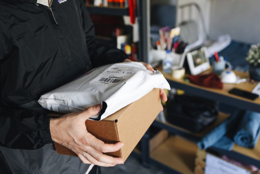
Even after someone decides to buy, unclear shipping information can still make them hesitate. Filipino buyers are used to comparing shipping fees and delivery times across platforms, so vague or missing shipping details can quietly kill a sale.
Make sure your store clearly shows:
- Which couriers you work with and estimated delivery times per area
- Shipping costs upfront, not as a surprise at the final checkout step
- Order tracking, so customers aren’t left wondering where their package is
- Clear policies for delayed or lost deliveries, which builds confidence even before something goes wrong
Your Complete E-commerce Checklist
Here’s the full list in one place, so you can quickly check where your store stands:
- GCash and Maya payment integration, plus card and COD options
- Mobile-optimized layout with tappable buttons and fast-loading pages
- Guest checkout with transparent pricing and minimal form fields
- SSL certificate and secure, recognized payment processing
- High-quality product photos with clear, specific descriptions
- Visible customer reviews or ratings
- Clear shipping costs, courier options, and delivery tracking
- Simple return and refund policy stated clearly on the site
If you’re missing more than a couple of these, that’s likely where your sales are quietly slipping through the cracks.
How Rypaci Can Build Your E-commerce Website Design Checklist Into Your Store
At Rypaci IT Solutions, we build online stores for Davao retailers with these essential e-commerce website features to increase sales for local retailers built in from the start, not added as an afterthought once sales aren’t coming in. That means GCash and Maya integration set up correctly, mobile-first design that actually works on real phones, and checkout flows built to reduce drop-off, not increase it.
We understand that most retailers reading this aren’t developers, and you shouldn’t have to become one just to sell online. Our job is to handle the technical side so your store is ready to convert visitors from day one.
Ready to Turn Browsers Into Buyers?
Building an online store in 2026 isn’t just about getting something live. It’s about making sure every part of the experience, from the first product photo to the final payment confirmation, gives customers a reason to trust you and complete the purchase.
Ready to build an online store that actually sells? Let Rypaci help you get started, talk to us today.